How I built my Personal Blog - Adding support for MDX and styling with Tailwind - Part 2
It's been a long time since my last post covering how I built my new Personal Blog Site using Next.js 13 and Contentlayer. In the last post I finished off by saying I would be posting additional parts each week but as is quite evident by the *cough* 5 month gap between this post and the last that didn't quite go to plan. However, I'm now back so I would like to welcome you to the 2nd part of this series!
At the end of the last post we had a working (albeit basic) blogging system that allowed us to create markdown .md files in
/posts that are then transformed into type-safe TS data we can render into pages using Next.js. We also created a simple feed
page that displays all of our posts allowing you to navigate between them.
This is a great starting point for building further and if all you want is a basic blog you could build on this with additional styling to make it your own as it is, but could we make it any better? 🤔 Of course we can!
At the end of my last post I hinted towards a number of features that could be implemented to improve the site; Support for MDX (React Components within Markdown), Styling the generated html with TailwindCSS, Markdown extensions such as GFM and Code Syntax Highlighting, Metadata & OpenGraph Image Generation and much more. In this post we are going to explore how the first two of these features can be implemented.
If you want to follow along the full code featured in all of the below snippets is available on my GitHub DrBarnabus/next13-blog.
This is the second part of a series of posts on this topic, if you want to checkout the first part you can find it here.
MDX
Firstly what is MDX, if you haven't heard of it or used it before MDX is an extension to Markdown that lets you include JSX/TSX elements in Markdown documents. Now this can be massively useful for adding custom functionality into your site while keeping your content in an easily manageable and understandable markdown format. A great example of a usage for MDX is the Table of Contents further up on this page, it's implemented using a TSX component and added to the page using MDX and the items are represented as a simple markdown unordered list.
Enabling support for MDX
Luckily for us Contentlayer has great support for MDX so enabling this feature is a breeze. First of all we need to update our Contentlayer
config contentlayer.config.ts in the root of the project, we need to change our file pattern and specify that our content is now
expected to be processed as MDX:
  name: 'Post',
  filePathPattern: '**/*.mdx',
  contentType: 'mdx',
Once that's been added you will need to update any existing .md files in your /posts directory to the .mdx extension.
With those updated if you now start your site using yarn dev you'll get an error 😢 but that's expected because we can't render MDX
into the page the same way we did with our Markdown. Previously we rendered the generated HTML directly into a <div> on our page like so:
<div dangerouslySetInnerHTML={{ __html: post.body.html }}></div>Now if you've done everything correct so far the property html should be underlined with an error, and that's because Contentlayer is
no longer directly generating the HTML for our Markdown (or more specifically now MDX) files. Instead it provides a new property code,
now you may be thinking you can just replace html in our page with code but it isn't quite that simple. While replacing it does
indeed remove the error if you look at the post you will quickly see that it hasn't quite generated what you would expect. Instead it's showing
the raw JS code for the MDX page as plain text which is not what we want at all 👎 instead we need to follow a slightly different process to
render our MDX code.
Rendering our MDX
Now rendering our post.body.code on our page is actual quite simple, we just have to feed that data into Contentlayer's MDX component
hook. This hook takes in our code and provides us with a customizable component to use in our page.tsx that will both render
our MDX code and provide us with an interface to customize the JSX/TSX component building blocks that will be used to render the resulting
HTML.
For reasons that will become clear further into this post, we're going to start by creating a new component to
render our MDX that's wrapped in a <section>...</section>:
'use client';

import { useMDXComponent } from 'next-contentlayer/hooks';

type Props = {
  code: string;
};

export function MdxContent({ code }: Props) {
  const Component = useMDXComponent(code);

  return (
    <section>
      <Component />
    </section>
  );
}
Once we have this newly created component we can replace line 37 in src/app/posts/[...plug]/page.tsx that we saw before with it. We
need to pass post.body.code into the component so that it can be rendered by the useMDXComponent hook we saw above:
<MdxContent code={post.body.code} />And with those simple changes you should now see your MDX content correctly rendered to the screen 🥳🎉
Custom MDX Components
Now we've got our .mdx posts rendering in Next.js we can start to leverage the features that MDX provides. Mainly the ability to
both customize base components of Markdown as well as adding additional components.
Let's start by looking how we can customize an existing function of Markdown such a links. Let's say you want links to internal pages (like
other posts) to use next/link, while other links should just use a standard <a href="..."></a> tag. Perhaps we also want
external links to open in a new tab/window by default and we want to specify rel="noopener noreferrer" on the anchor element to
prevent the opened website from getting a referrer or a reference to the window that opened it.
To do this we can specify TSX/JSX components that should be used while rendering the MDX, by matching this with the element we want to customize we can override it's default behaviour as shown below:
'use client';
import { useMDXComponent } from 'next-contentlayer/hooks';
import Link from 'next/link';
type Props = {
code: string;
};
function a({ href, children }: React.HTMLProps<HTMLAnchorElement>) {
if (href && href.startsWith('/')) {
return <Link href={href}>{children} next/link</Link>;
}
if (href && href.startsWith('#')) {
return <a href={href}>{children} relative <a></a>
}
return (
<a href={href} target="_blank" rel="noopener noreferrer">
{children} external <a>
</a>
);
}
export function MdxContent({ code }: Props) {
const Component = useMDXComponent(code);
return (
<section>
<Component components={{ a }} />
</section>
);
}
By adding our custom a component to the components object we have overridden the default behaviour of a link within our
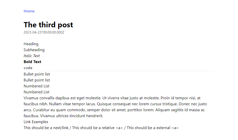
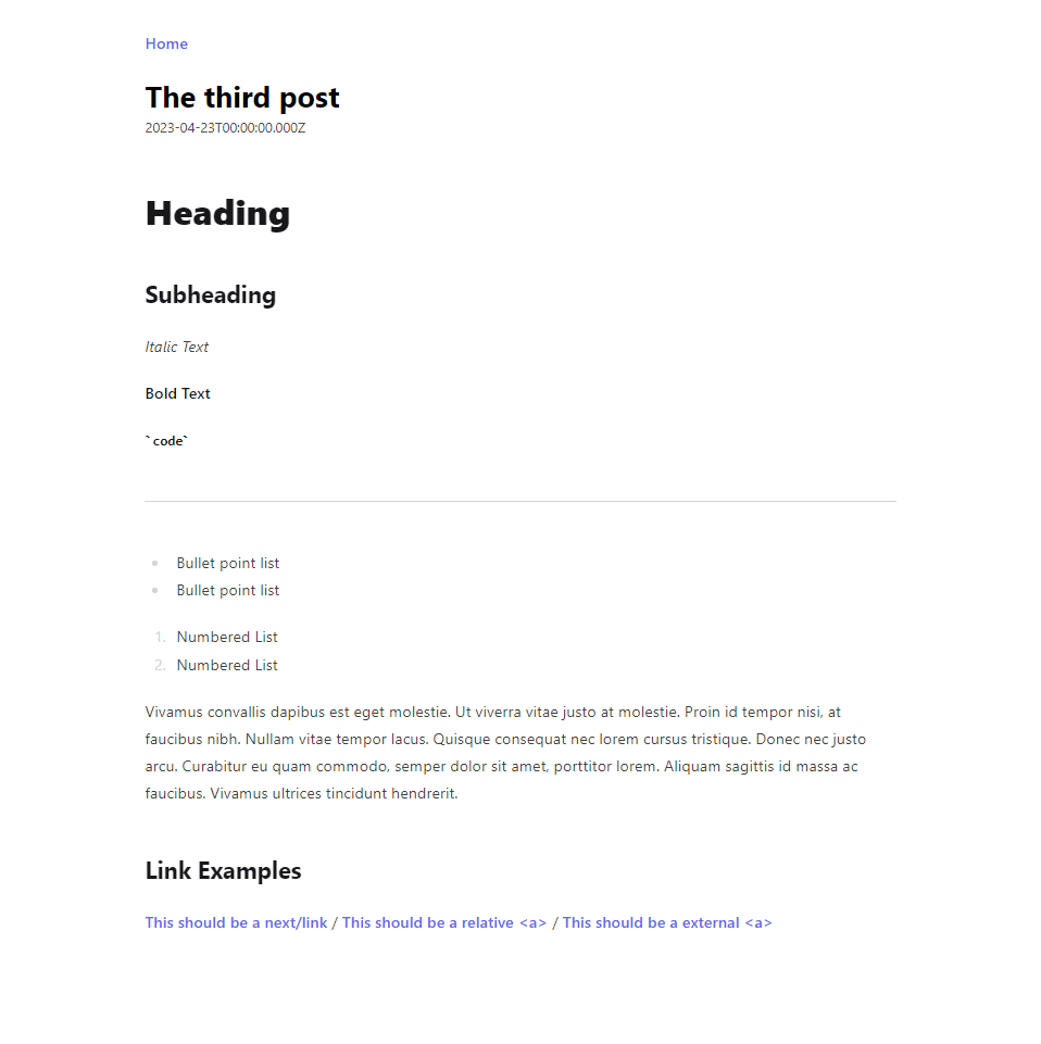
rendered MDX. If you add the following MDX content into a post you should see three links rendered; a next/link, a relative <a>
and an external <a>.
[This should be a](/posts/post-02) / [This should be a](#dolor) / [This should be a](https://danielwoodward.dev)You can also use this to implement new custom components for use in your MDX, for example here is a snippet of the Table of Contents component I use on my blog (you can see it at the top of this page):
// ...

const TableOfContents = ({ children }: Props) => {
  const [expanded, setExpanded] = useState(false);

  return (
    <div className="my-5 flex w-full flex-col rounded bg-zinc-200/40 dark:bg-zinc-800 sm:w-2/5">
      <button
        className={cx(
          'flex flex-row items-center gap-6 rounded bg-zinc-200 px-4 py-2 font-bold text-zinc-700 dark:bg-zinc-700 dark:text-zinc-50',
          expanded ? 'rounded-b-none' : ''
        )}
        onClick={() => setExpanded((prev) => !prev)}
        aria-label="Expand Table of Contents"
      >
        <span>Table of Contents</span>
        <ChevronDown className={cx('ml-auto h-4 w-4 transition-transform duration-300 ease-in-out', expanded ? 'rotate-180' : '')} />
      </button>
      {expanded && <div className="p-2 prose-ul:!my-1">{children}</div>}
    </div>
  );
};
This can then be added to the components in MdxContent and used in MDX files like so:
<TableOfContents>
- [Link 1](#link-1)
- [Link 2](#link-2)
</TableOfContents>
Pretty much anything you can build with React you can build into an MDX component so be creative, the only limit as with most things on a custom blog is your creativity and patience so go wild.
Styling with TailwindCSS
Now if you've been following along at home so far you might have noticed that the HTML generated by Contentlayer (whether Markdown or MDX) is for the most part unstyled. Some basic functionality such as creating Italic/Bold/Code text works but if you add headings, bullet point lists, numbered lists, links and other content it will be completely unstyled which isn't great to look at.
The easiest way to solve this problem is with a plugin for TailwindCSS (@tailwindcss/typography)
which provides us a set of .prose classes that we can use to style any vanilla HTML code that we don't have direct control of.
This means we can adjust the styles of the generated HTML without adding any additional classes or customization during the generation of
our HTML.
Firstly we need to install the plugin yarn add @tailwindcss/typography and then we can enable it to our Tailwind config file:
/** @type {import('tailwindcss').Config} */
module.exports = {
  content: ["./src/**/*.{ts,tsx}"],
  theme: {},
  plugins: [require('@tailwindcss/typography')],
};
Now if you recall back to when we setup MDX I said we would create a component called MdxContent with a <section>...</section>
which didn't seem to have a usage at the time. Well now is it's time to shine, by adding some of our newly enabled TailwindCSS Typography
classes to this section we can enable styling of our generated HTML. Here's a good starting point that gets most of our styling working
as you would expect:
// ...

export function MdxContent({ code }: Props) {
  const Component = useMDXComponent(code);

  return (
    <section className="prose prose-base prose-zinc max-w-none pb-4 pt-8 prose-headings:drop-shadow-sm prose-a:text-indigo-500 prose-a:no-underline hover:prose-a:text-indigo-300 hover:prose-a:underline prose-hr:border-zinc-300 prose-blockquote:border-l-zinc-300 prose-ul:my-4 prose-li:my-0 prose-li:marker:text-zinc-300">
      <Component components={{ a }} />
    </section>
  );
}
There are a number of .prose classes that can be applied in various different situations if you want to you can find out more about
them here. If your styling the rest of your blog using Tailwind you should be able to find a combination of
these classes to make the generated content fit the styling of the rest of your site.
So what's next?

Well let's check in with our list of additional features that we could implement that we set out in Part 1 of this Series:
Supporting MDXProperly styling the generated HTML with @tailwindcss/typography- Support for GitHub Flavoured Markdown
- Code Blocks with proper Syntax Highlighting and Copy to clipboard
- Inline images with captions using @next/image
- Auto-linking headings
- Adding Metadata such as Title/Description/Topic/Tags both visually on the page and in the
<head>meta - Dynamic OpenGraph Image Generation
In the next post I'm planning to cover enabling GitHub Flavoured Markdown as well as how to build and deploy our blog to Vercel, once that post is available (which I promise won't be a 5 month wait this time) a link will be added at the bottom of this page.
If your following along with this series and want to see a full working example of the snippets listed above this is available ony my GitHub DrBarnabus/next13-blog or feel free to checkout the code for my personal site which is also on my GitHub DrBarnabus/danielwoodward-dev.
Thanks for taking the time to read my post, I hope you enjoyed reading it! If you did I would greatly appreciate it if you shared it with your friends and colleagues.
Whether you did or you didn't I would love to hear your feedback; what works, what doesn't, did I leave anything out? Unfortunately I haven't implemented comments yet, but my socials are linked in the footer of this page if you wish to contact me.
If you liked this post, then you might also be interested in:
Enriching your Next.js blog by enabling GitHub Flavoured Markdown, Code Syntax Highlighting and upgrading to Next.js 14!
The process of how to build a blog with Next.js 13 App Directory, Vercel and Contentlayer. I'll be covering all of the details to get this setup and add some extra features!